Article: Tonal Reticence
Tonal Reticence
Remove color from an object and the surface comes forward. The ridge left by a thumb pressing clay into form, the slight variance in a glaze where the kiln breathed unevenly, the way a matte finish holds morning light differently than it holds afternoon light — none of this was invisible before, but color competed with it. Tonal reticence is not the absence of character but the condition under which material is finally allowed to speak.
This is the first argument for objects that are monochromatic: they give back the surface. A celadon grey bowl, a smoke-fired vessel, a piece whose entire register lives in the distance between warm white and cool white — these occupy a different kind of neutrality, receptive rather than inert. The eye, finding nothing to land on, begins to move. It follows texture. It notices weight. It reads the form the way you read a sentence written in a very quiet font — not because the font has nothing to say, but because it has chosen not to shout over the content.
There is a second argument, more physical. A monochromatic object borrows color from everything around it. A grey-white vessel in January holds the specific quality of winter light — flat, diffuse, slightly blue at the edges — in a way it cannot hold April light, which arrives warmer and at a lower angle and turns the same surface briefly gold. The object does not change. The season moves through it. This is what makes tonal reticence a longtermist position rather than a stylistic one: the object does not commit to a moment. It persists across all of them.

A vessel without strong color allows arrangement without a system. A dark branch in November, a stem of white narcissus in March, a spray of dried seed pods in August — the same piece receives all of them without requiring the arranger to solve a color problem first. What remains to be solved is arguably more interesting: proportion, height, the relationship between the stem and the lip of the vessel, the space left between. Tonal reticence returns constraint to where it belongs — not in the object's color but in the arranger's eye.
Clearing
Strong color in a room works the way a focal point works in painting. It organizes attention into a hierarchy — tells the eye where to land, creates a fixed axis around which everything else yields. A single cobalt wall, a lacquered red table: these are legitimate and sometimes beautiful modes of inhabiting a space. They direct. The room with a dominant chromatic event produces a particular alertness, an orientation. You always know where you are in it.
Tonal reticence produces something different. With no fixed axis, attention releases rather than directs. The room holds itself open. For people whose working lives already require sustained visual decision-making — whose days run on directed attention, chromatic saturation, the management of competing stimuli — this release is the point. The room becomes a reset rather than an extension of the day's demands.
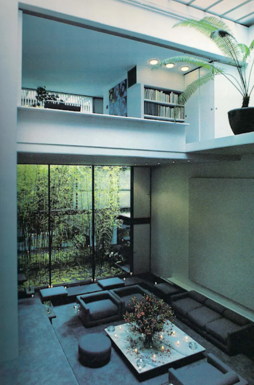
When Halston commissioned Paul Rudolph to transform a five-story townhouse on East 63rd Street in 1967, the resulting interior was brutal in its tonal restraint — polished chrome, grey suede, mirrored surfaces that multiplied grey light rather than introducing color. Rudolph's architecture was the most severe element in Halston's otherwise maximalist life: a space whose visual temperature dropped the moment you entered it, so that what you brought inside — the people, the flowers, a red coat left on a chair — became the event the room had been quietly waiting to frame. The architecture yielded to the life within it.
"A world of its own, inward looking and secretive, is created in a relatively small volume of space in the middle of New York City. Varying intensities of light are juxtaposed and related to structures within structures. Simple materials (plaster, paint) are used, but the feeling is of great luxuriousness because of the space. The one exposed facade reveals the interior arrangement of volumes by offsetting each floor and room in plan and section."
— Paul Rudolph in Moholy-Nagy, Sibyl, and Gerhard Schwab, The Architecture of Paul Rudolph. New York: Praeger, 1970. P. 80
Halstons House, Paul Rudolph, 1968


Sam Shahid's prewar apartment in Greenwich Village operates on the same logic at a quieter scale. Shahid, whose professional life as an art director was built on images designed to stop people — the carefully composed provocation, the picture that demanded to be seen — described the brief for his own home in a single word: silence. Nearly everything he owned was stored behind doors that blended seamlessly with the walls. What remained visible was sparse, specific, chosen for material quality rather than chromatic presence. He had spent thirty years directing attention outward. The apartment was built to let it rest. Tonal reticence here was less an aesthetic preference than a physiological one — the room as counterweight to a life already saturated with looking.
Photography by François Halard, T-Magazine


Both spaces share the same consequence: anything introduced becomes legible. A vase of something seasonal on a chrome surface in Rudolph's townhouse. A single Poul Kjærholm chair holding daylight in Shahid's living room. The restraint is the condition that makes other things visible — that clears space for the spontaneous, the impermanent, the brought-in. A room that has already made up its mind about color leaves little room for change. A room that has not become available to the day.
This is, perhaps, also an argument about the kind of person drawn to tonal reticence — more for intimacy than statement, more for the quality of a Tuesday morning than for the occasion of an event. The object that is monochromatic accompanies.
Material
This is the logic behind Jade Grain's collection. Across makers — Jingwen Wu's metal-glazed porcelain, Dong Dan's black-glazed vessels, Li Yao's cloth-pressed surfaces, Kenichi Sasakawa's grey mineral glass — the chromatic range is narrow by design. Each maker arrived at restraint through the same pressure: material taken seriously tends toward its own tone. Metal glaze on porcelain produces that particular cool sheen, neither silver nor grey but something between. Black glaze built to sit between matte and gloss produces depth without reflection. Cloth pressed into clay before firing leaves a whisper of weave behind. Minerals mixed in glass produce color that shifts with the light source rather than holding a fixed position. The palette is not imposed. What the material produces when left to its own logic.
Where tonal reticence becomes inseparable from materiality is at the level of attention it demands. Color, when it is strong, asks to be looked at before the surface has a chance to speak. Reduce it to the point where it is barely a tint, barely a leaning, and what the eye encounters instead is texture at a resolution that colored objects rarely permit. The horizontal ridges on a Jingwen Wu bowl, pressed in at intervals, become a kind of tactile score: the eye reads them as if running a finger along them, registers their spacing, their slight irregularity, the way shadow collects. The same ridges on a brightly colored piece would recede behind the color. On a grey-brown surface they are the event.

The consequence, over time, is that these objects belong to something slower than a decade. They carry the year of their making, the mentality of the hand that shaped them — but they do not insist on it. What they ask of the person who lives with them is a corresponding pace: the willingness to look without a destination, to notice what changes when the light shifts, to find the day's small variations sufficient. Tonal reticence, at this scale, is less a curatorial position than a way of moving through a day — the objects, the room, the arrangement, all of it tuned to the same register:
Quiet, without being empty. Unhurried, without being still.